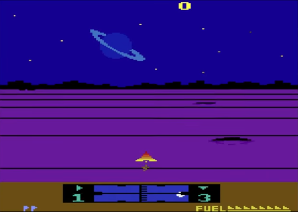
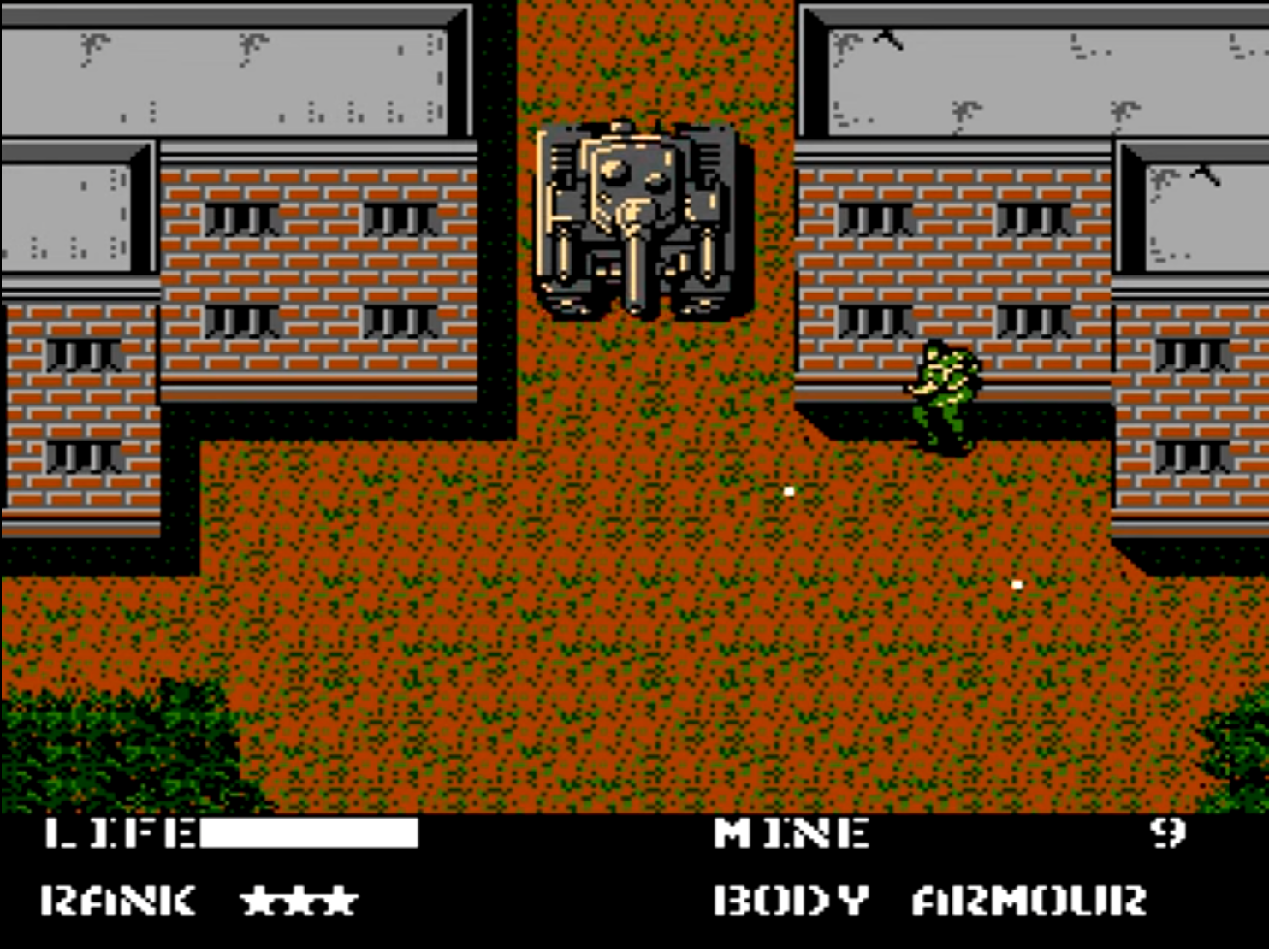
As the gaming industry evolves and introduces cutting-edge graphics and immersive experiences, one might wonder why these pixelated, seemingly simplistic games still hold a special place in our hearts. Let’s delve into the reasons behind the distinct appearance of retro games, exploring factors such as technological limitations, artistic styles, and nostalgia.
The early days of gaming were marked by significant hardware constraints, which played a crucial role in shaping the look and feel of retro games. Memory limitations, limited processing power, and display resolutions were some of the primary factors influencing the design of these games.

Memory Limitations
Early gaming consoles, such as the Atari 2600 and the Nintendo Entertainment System (NES), had limited memory, which affected the games’ graphical capabilities. The Atari 2600 had only 128 bytes of RAM, while the NES had just 2KB of RAM. In comparison, modern gaming consoles like the PlayStation 5 boast 16GB of RAM. This disparity in memory capacity resulted in early game developers having to create games with simple, low-resolution graphics to fit within these constraints.
Limited Processing Power
Another factor that shaped the appearance of retro games was the limited processing power of early gaming systems. The Atari 2600 had a processing speed of 1.19 MHz, while the NES clocked in at 1.79 MHz. Today’s gaming consoles, on the other hand, operate at speeds of several gigahertz. This lack of processing power made it challenging for developers to create complex animations or render high-resolution graphics.
Display Resolution and Color Palettes
The display resolution and color palettes available on early gaming systems also played a significant role in defining the appearance of retro games. For instance, the Atari 2600 had a resolution of 160×192 pixels and could display a maximum of 16 colors. The NES had a slightly better resolution of 256×240 pixels and could display up to 64 colors. This limitation forced designers to choose colors carefully, leading to the vibrant and sometimes quirky color schemes that are now synonymous with retro gaming.
Evolution of Gaming Technology
As technology advanced, gaming consoles became more powerful, enabling developers to create more visually impressive games. For example, the Super Nintendo Entertainment System (SNES) featured a resolution of 512×448 pixels and could display 32,768 colors, leading to richer, more detailed graphics. Despite these advancements, the aesthetics of early gaming systems continue to influence the design of modern games, as we will explore later in this essay.

Pixel Art
Pixel art emerged as a popular artistic style in the 1980s due to the limitations of early gaming systems. This art form involves the creation of images using a limited number of pixels, resulting in a blocky, low-resolution aesthetic. Artists had to work with a restricted color palette and carefully place each pixel to create recognizable characters, objects, and environments. These pixelated images, known as sprites, were the building blocks of retro game visuals. Designers had to be incredibly creative within these constraints, leading to the iconic, stylized look of games from this era.
To save memory, games were often designed using a tile-based system. Game environments were constructed from grid-like patterns where each ’tile’ was a small, reusable chunk of graphics. This method was efficient but also limited the variability in game environments, contributing to the repetitive, yet charming, background designs in many retro games.
Popular Genres and Themes
The visual design of retro games was also influenced by popular genres and themes of the time. Many early games drew inspiration from other forms of media, such as films, comics, and television. Classic titles like “Metroid,” “The Legend of Zelda,” and “Space Invaders” incorporated elements of science fiction, fantasy, and adventure, shaping the appearance of these games and contributing to their timeless appeal.
For instance, “Metroid” was heavily inspired by the 1979 film “Alien,” which is evident in the game’s dark, atmospheric environments and the design of its protagonist, Samus Aran. Similarly, “The Legend of Zelda” borrowed elements from fantasy literature, creating a rich and immersive world filled with dungeons, mythical creatures, and magical artifacts.
Kojima’s magnum opus, the “Metal Gear” series, first released in 1987, is a quintessential example of this influence. The series is renowned for its intricate storyline, stealth gameplay, and cinematic presentation, elements heavily inspired by science fiction films of that era. The narrative complexity and the dystopian themes in his games mirror the tones of movies like “Blade Runner” (1982) and “The Terminator” (1984) and “Akira” (1988). The bleak, cyberpunk aesthetic of these films is vividly echoed in the design and world-building of the “Metal Gear” universe, and of course the incomparable Snatcher.
Designing Around Technological Limitations
Developers had to work within the constraints of early gaming systems to create engaging and enjoyable experiences for players. This often meant opting for simple graphics and animations while emphasizing gameplay mechanics. For example, “Pac-Man” features straightforward graphics and a limited color palette, yet its addictive gameplay and well-designed levels have stood the test of time. Others include:
1. “Super Mario Bros.” (1985, NES): The quintessential example of ingenuity in the 8-bit era, Nintendo’s “Super Mario Bros.” revolutionized the platformer genre. Limited by the NES’s color palette, designers used Mario’s mustache and hat to avoid the need for complex facial animations. His distinct red and blue outfit was chosen for contrast against the background, making the character visually pop. The game’s designers also cleverly reused assets; for instance, the clouds and bushes are the same sprite, just colored differently. This efficient use of limited resources didn’t just work around the technology of the time; it defined an aesthetic that is iconic even today.
2. “The Legend of Zelda” (1986, NES): This game broke ground by saving a player’s progress, a novel feature at the time. The designers creatively incorporated a battery-backed memory chip in the cartridge, allowing players to save their journey in the vast world of Hyrule. This workaround not only overcame the limitation of short play sessions but also laid the foundation for complex storytelling and game progression in future titles.
3. “Metroid” (1986, NES): In “Metroid,” designers used the hardware’s limitations to enhance the game’s atmosphere. The NES’s limited color palette contributed to the game’s eerie and alien feel. The designers also implemented a technique called ’tile mirroring’ to maximize the use of the NES’s limited memory, allowing for larger, more intricate maps that gave players a sense of a vast, unexplored world.
4. “Mega Man” (1987, NES): The creation of “Mega Man” showcased ingenious sprite design and color usage. To combat flickering and slowdown caused by the NES’s limited sprite handling capabilities, designers used simple, clean lines and a limited color palette for character sprites. This approach not only made characters distinctive but also ensured smoother gameplay.
5. “Castlevania” (1986, NES): Konami’s “Castlevania” used parallax scrolling to create a sense of depth and immersion, a clever trick given the NES’s simple graphics. This technique created multi-layered backgrounds that moved at different speeds, simulating a more three-dimensional space within the game’s 2D environment.
The look of retro games is a testament to the creativity and resourcefulness of early game designers. They turned the limitations of their tools into a distinctive visual language that not only defined a generation of gaming but also continues to influence modern game design and pixel art. The charm of these games goes beyond nostalgia; it’s a celebration of the art that can be created within, and in spite of, constraints.
